The data
Today I explore two small datasets from the French train company, the SNCF. I chanced upon this dataset yesterday when I was exploring the open French datasets.

As a long-term user of French trains (and a delays serial complainer), I was immediately interested in their delay data. 1
The SNCF provides several datasets, on high-speed trains, between-region trains and regional trains. Since I mostly use the first one these days, and they are freaking expensive, I decided to investigate high-speed trains (aka TGV).
Data info and structure
The datasets were downloaded on the 1st of February 2019 on the Open Data of the French train company: train delays global and train delays per train line.
The two files concern the French high speed trains. Their structure is simple.
tgv_axes:
- year: from 2015 to November 2018,
- month_number: which month the data concerns (1 to 12),
- axe: which high speed line was concerned (see below for details),
- month: which month the data concerns,
- departure_punctuality: number of trains that left on time at their departure station, over all trains that left this station. Expressed in percentage of trains that departed that month and on this line,
- composite_regularity: number of trains that arrived on time at arrival over all trains that arrived at arrival from that axe. Except that for this rate, te “on-time” criteria depends on trip lenght. A train is counted on-time if:
- for trips shorter than 1h30: there is <5min delay at arrival
- for trips between 1h30 and 3h: there is <10min delay at arrival
- for trips longer than 3h: there is <15min delay at arrival
tgv_global: mostly the same but without the axe column.
Precision of the delay measurement (mostly automatic): the minute (floored).
The global dataset is not the mean over the axes of the axes dataset.
The dataset only contains trains operated by the SNCF (not other companies such as Eurostar or Thalys).
tgv_axes %>%
count(axe, sort = TRUE) %>% kable()| axe | n |
|---|---|
| Atlantique | 47 |
| Est | 47 |
| Nord | 47 |
| Sud-Est | 47 |
| Europe TGV | 44 |
| OUIGO | 36 |
| Europe | 3 |
The Sud-Est, Nord, Est, and Atlantique axes correspond to the four Paris TGV stations and the areas of France they deserve. Trains that move from a sector to another are accounted for in both axes.
Europe TGV pools trains with international destinations. For some reason, the Europe category is separated from Europe TGV, and only contains three trains. I merge the two levels using the fct_collapse() function from the forcats package.
tgv_axes <- tgv_axes %>%
  mutate(axe = fct_collapse(axe,
                            "Europe" = c("Europe TGV", "Europe")
  ))
In order to make plotting easier, I create ordered year and month ordered factors.
# Make year as ordered factor
tgv_global$year_ordered = factor(tgv_global$year, ordered = TRUE)

# Get months in English
tgv_global$month_english = factor(tgv_global$month_number, ordered = TRUE)
levels(tgv_global$month_english) <- c("January", "February", "March", "April", "May", "June", "July", "August", "September",  "October", "November", "December")


# Make year as ordered factor
tgv_axes$year_ordered = factor(tgv_axes$year, ordered = TRUE)

# Get months in English
tgv_axes$month_english = factor(tgv_axes$month_number, ordered = TRUE)
levels(tgv_axes$month_english) <- c("January", "February", "March", "April", "May", "June", "July", "August", "September",  "October", "November", "December")
National data
Let’s first look at the global averages over time. I first plot punctuality across time with a simple line plot.
tgv_global %>%
  ggplot(aes(x = month_english, y = departure_punctuality,
             group = year)) +
  stat_summary(fun.y = mean, geom = "line",
               size = 2, colour = "#CBBA69FF") +
  facet_wrap(~year, nrow = 2) +
  labs(title = "Punctuality of French High Speed Trains",
       subtitle = "Percentage of train leaving on time over all trains leaving",
       x = "Month",
       y = "Punctuality") +
  theme_ipsum_rc() +
  ylim(70, 90) +
  theme(axis.text.x = element_text(angle = 90, vjust = 0.5)) +
  scale_colour_viridis_c()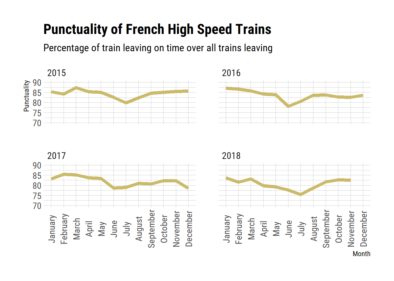
For some reason there is a peak of delay in June or July every year. Is this because a lot of people leave on holidays at this period? But then I would expect lots of problems in August or December, and these months do not seem to be much affected.
Since time data is often readily plotted with heat-maps, I use the geom_tile geom from the ggplot2 package to plot the punctuality over time
tgv_global %>%
  ggplot(aes(x = month_english, y = factor(year_ordered, levels=rev(levels(year_ordered))),
             fill = departure_punctuality)) +
  geom_tile() +
  labs(title = "Punctuality of French High Speed Trains (TGV)",
       subtitle = "Percentage of TGV trains leaving on time over all HST trains leaving",
       caption = "Data: data.sncf.com",
       x = "Month",
       y = "Year",
       fill = "Rate of trains on time") +
  theme_ipsum_rc() +
  theme(axis.text.x = element_text(angle = 90, vjust = 0.5)) +
  scale_fill_viridis_c(option = "cividis")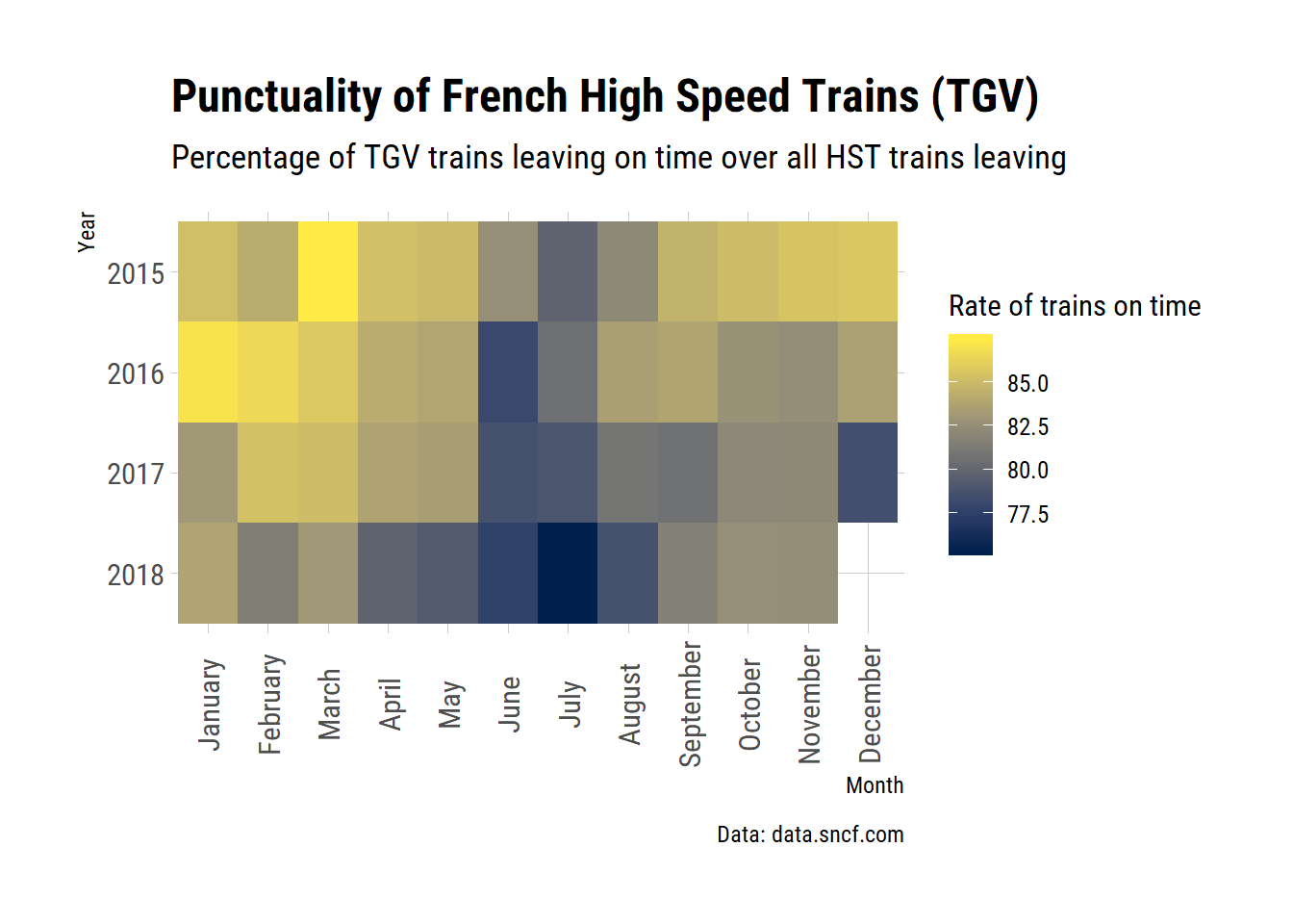
This was a good idea, as this representation allows a better comparison of year. We can see that 2018 was a bad year in terms of train delays. There was a very long strike in the spring and summer of that year, and it probably affected train punctuality.
Train regularity
Now let’s look how the composite index of regularity evolves over time.
tgv_global %>%
  ggplot(aes(x = month_english, group = year)) +
  stat_summary(aes(y = composite_regularity),
               fun.y = mean, geom = "line",
               size = 2, color = "#31446BFF") +
  stat_summary(aes(y = departure_punctuality),
               fun.y = mean, geom = "line",
               size = 2, color = "#CBBA69FF") +
  facet_wrap(~year, nrow = 2) +
  labs(title = "Regularity and punctuality of French High Speed Trains",
       subtitle = "Green = regularity\nRed = punctuality",
       caption = "Data: data.sncf.com",
       x = "Month",
       y = "Percentage of trains") +
  theme_ipsum_rc() +
  ylim(70, 100) +
  theme(axis.text.x = element_text(angle = 90, vjust = 0.5))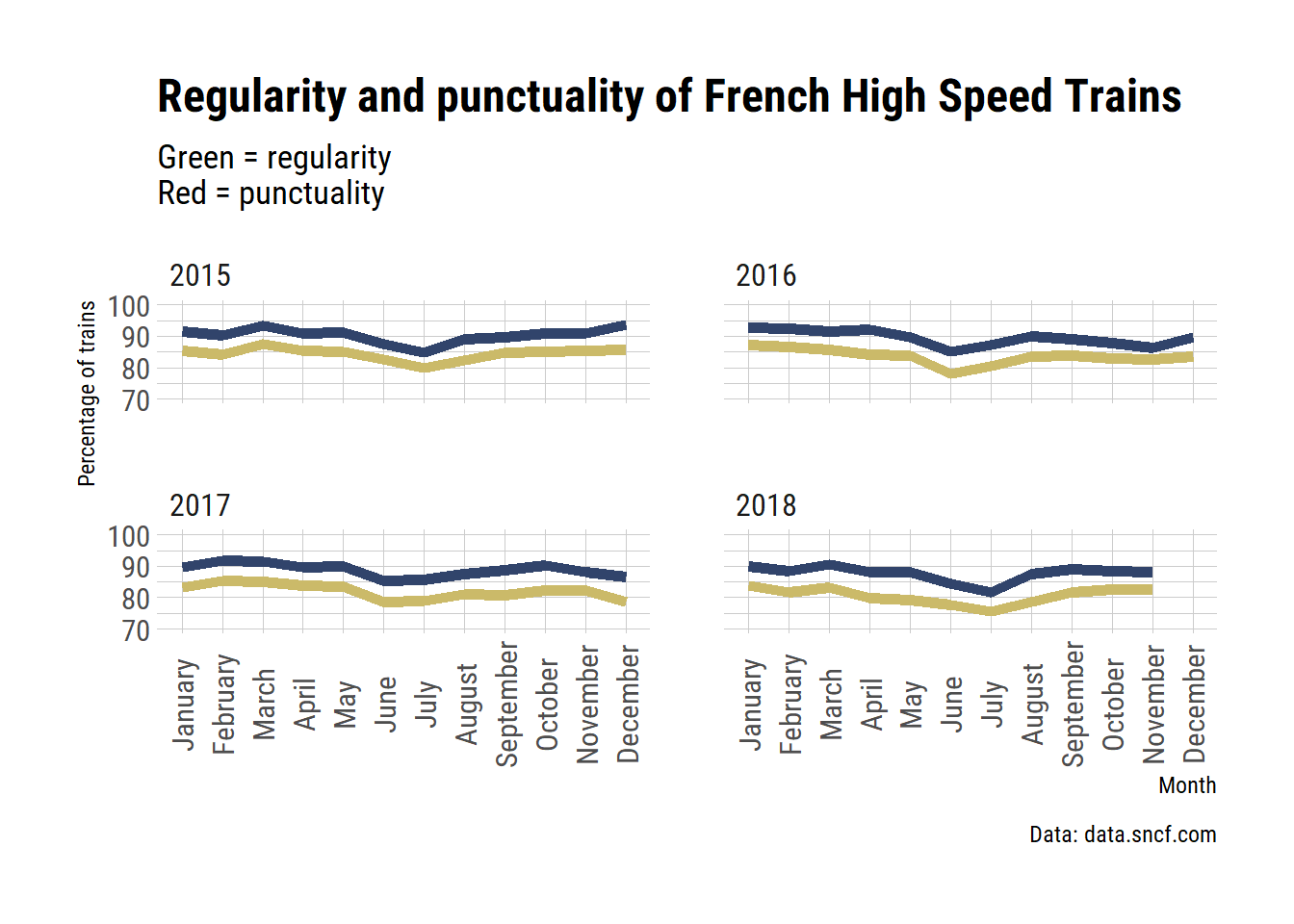
Both punctuality and regularity covary strongly. The main difference is that the regularity allow them to have seemingly higher rates of punctual trains, because it decreases the impact of delays up to 15 minutes on longer trips.
Since both rates are similar, I will report only the punctuality from now on.
By axes
Now, let’s have a look at how these delays are distributed over the train axes.
We can first average the punctuality per axe over time.
tgv_axes %>%
  group_by(axe) %>%
  summarise(mean_punctuality = mean(departure_punctuality),
            sd_punctuality = sd(departure_punctuality)) %>% ungroup() %>%
  mutate(axe = fct_reorder(axe, mean_punctuality)) %>%
  ggplot(aes(x = axe, y = mean_punctuality)) +

  geom_errorbar(aes(ymin = mean_punctuality - sd_punctuality,
                ymax = mean_punctuality + sd_punctuality),
                width = .2, size = 1) +

  geom_bar(stat = "identity", fill = "#CBBA69FF") +
  labs(title = "Mean punctuality of French High Speed Trains per line",
       subtitle = "Averaged over time",
       caption = "Data: data.sncf.com\nError bars: standard-deviation",
       x = "Month",
       y = "Percentage of trains") +
  theme_ipsum_rc()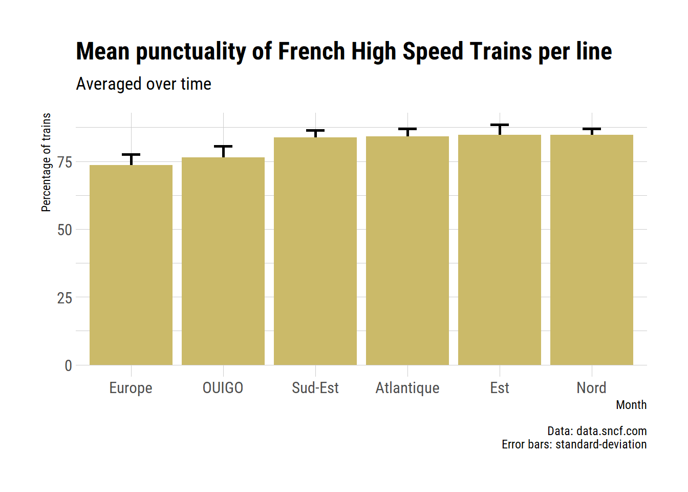
From this plot, it is obvious that the European axes and the OUIGO (the low-cost SNCF service) suffer from more delays than the other lines.
Let’s see if it’s true every year.
tgv_axes %>%
  ggplot(aes(x = month_english, y = departure_punctuality,
             group = axe,
             colour = axe)) +
  geom_line(size = 1.5) +
  facet_wrap(~year, nrow = 2) +
  labs(title = "Punctuality of French High Speed Trains",
       subtitle = "Per line",
       caption = "Data: data.sncf.com",
       x = "Month",
       y = "Percentage of trains",
       colour = "Axe") +
  theme_ipsum_rc() +
  ylim(60, 100) +
  theme(axis.text.x = element_text(angle = 90, vjust = 0.5)) +
  scale_colour_viridis_d(option = "cividis")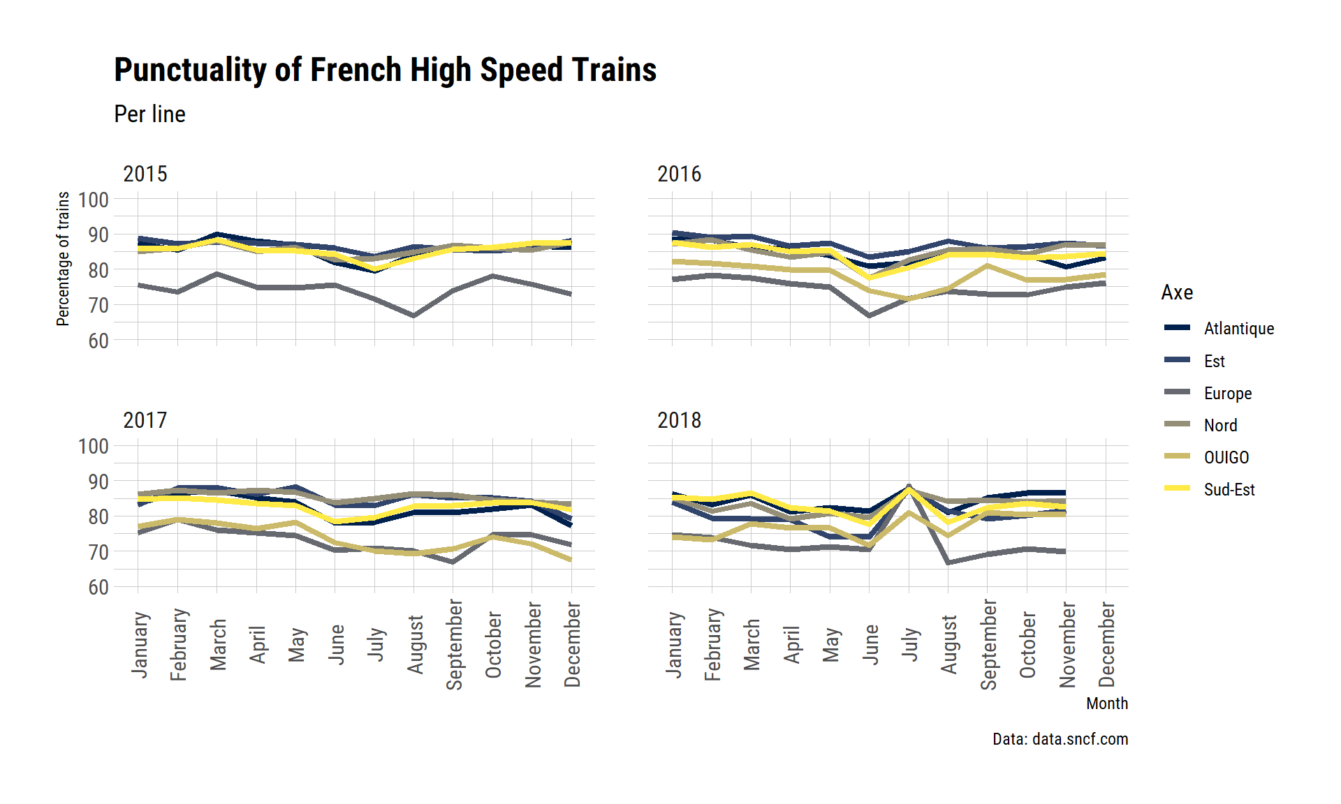
In 2015, the OUIGO data were not provided (although the train have ran since 2013). From 2016, its punctuality was similar to the TGVs that cross borders, that is, departing more often with a delay than the others.
I am curious at the peak of improved punctuality in 2018 in July. The national data showed a peak of delay at this time. The SNCF insist that the national average is not just the average over these data per lines, and that the rates depend on the number of trains that depart at each station, so this pattern is possible. We also need to remember that trains that go between the axes (say, from Atlantique to South-East) are accounted in both axes. If these trains are proportionaly more on time than trains within axes, they could bias punctuality upwards. I am not sure why that would be the case though.
This visualisation is not very satisfying, it is difficult to distinguish all the categories. I think we can do a better job with an heat-map.
tgv_axes %>%
  ggplot(aes(x = month_english, y = factor(year_ordered, levels=rev(levels(year_ordered))),
             fill = departure_punctuality)) +
  geom_tile() +
  labs(title = "Punctuality of French High Speed Trains (TGV)",
       subtitle = "Percentage of TGV trains leaving on time over all HST trains leaving",
       caption = "Data: data.sncf.com",
       x = "Month",
       y = "Year",
       fill = "Rate of trains on time") +
  facet_wrap(~axe, nrow = 2, scales = "free") +
  theme_ipsum_rc() +
  theme(axis.text.x = element_text(angle = 90, vjust = 0.5)) +
  scale_fill_viridis_c(option = "cividis")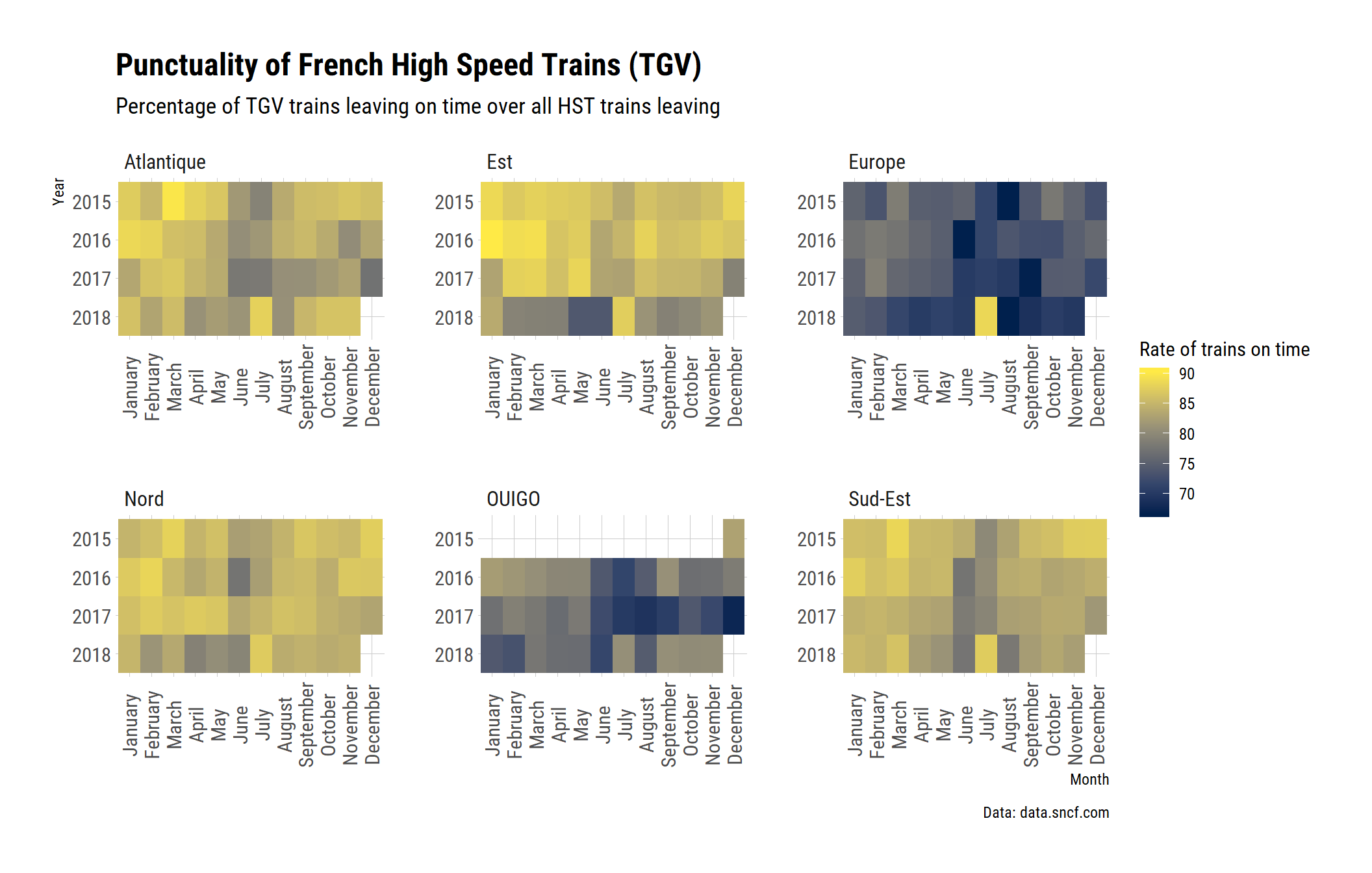
Some days you want to be optimistic and plot space lauch successes, some days you just want to see how bad the situation is.↩