I did not have time to explore milk consuption in the USA last week, and this week #TidyTuesday dataset does not really ignites my curiosity. But I would like to learn a little more about delays and cancellation of High Speed Trains in France.
Likely out of pure pettiness1.
So for my non-canon #Tidytuesday, carry on the work from the previous post and explore a dataset per line between towns (what the SNCF call “links”, or liaison in French). This dataset gives the detail of the number of trains, number of cancelled trains and number of late trains between to given stations, so it’s going to be fun to see which lines and stations suffer from most delay.
Originally, for this post, I wanted to map the data on a French map, but I encountered a bit of trouble in getting the GPS coordinates of the stations, and I am still perfecting my fuzzyjoining2. This might be a story for later, including the crushing of my cute naivety concerning name harmonizing in datasets made available within the same company.
The data
The dataset were downloaded on the 1st of February 2019 on the Open Data of the French train company.
The dataframe contains information on the number of trains, cancelled trains and delayed trains between two stations (links) for each month from 2015 to 2018.
The SNCF has several ways of quantifying train delays.
The punctuality is the number of trains that left on time at their departure station, over all trains that left this station on the perimeter. So here, punctuality is expressed in percentage of trains that departed that month and on this link.
The regularity is the number of trains that arrived on time at the terminus of the line over the number of trains that ran on the whole line.
A train can be counted in several “links”, but will be counted only once for the regularity. For example, let’s consider a (simplifed) line between Paris and Montpellier, with an intermediate stop in Lyon. Paris - Lyon is one link, Lyon - Montpellier is another link. A train leaving late from Paris will thus be counted as late in the Paris - Lyon link, and also in the Lyon - Montpellier link. However, it will be counted only once for the estimation of the regularity, which is fair if one wants national data on cumulative delay over the whole line. I am, however, interested in the distribution of delay over links, so we will not discuss the regularity here.
Technical information
Here, trip_duration is the expected duration of the trip in min.
The dataset provides some information on the source of delay. Here is the classification:
External causes: delay due to external problems (e.g. bad wheather, obstacles on train tracks, suspicious luggage (aka the-forgotten-luggage-of-doom-that-could-be-a-bomb), material destruction, strike etc.)
Railway infrastructure: maintenance, work on the railway network
Traffic management: problems in managing the rail traffic, in connecting the different networks. Which network (car network? TGV / Intercité network), I have no idea.
Driving meterial: I suppose that it means that there was a problem on the train itself (as opposed to rail or other aspect of infrastructure).
Station: delays due to station management and re-use of material. I suppose this encompasses the people (as in the driver is sick?) and waiting for a train that is late and need to be used for another trip.
Users: delays due to having to deal with users (too many users, trying to ensure a connection)
Also, on a totally unrelated note, todays’s colors come rom the very cute wesanderson package. Because I can.
Data wrangling
I will first sort the dates (turn them in ordered factors).
# Make year as ordered factor
tgv$year_ordered = factor(tgv$year, ordered = TRUE)

# Get months in English
tgv$month_english = factor(tgv$month_number, ordered = TRUE)
levels(tgv$month_english) <- c("January", "February", "March", "April", "May", "June", "July", "August", "September",  "October", "November", "December")
Then put the stations in title case, with the str_to_title function, because it’s prettier.
tgv <- mutate(tgv,
              departure_station = str_to_title(departure_station),
              arrival_station = str_to_title(arrival_station))
I will then make a departure and an arrival dataset, to simplify things.
tgv <- tgv %>%
  mutate(nb_trains = expected_nb_trains - nb_cancelled_trains)

tgv_departure <- tgv %>%
  select(year,
         nb_trains,
         month_number,
         year_ordered,
         month_english,
         service,
         departure_station,
         trip_duration,
         expected_nb_trains,
         nb_cancelled_trains,
         contains("departure"))


tgv_arrival <- tgv %>%
  select(year,
         nb_trains,
         month_number,
         year_ordered,
         month_english,
         service,
         departure_station,
         trip_duration,
         expected_nb_trains,
         nb_cancelled_trains,
         contains("arrival"))
Cancelled trains
We can see that in general, there are a less than fifty trains cancelled per link and per month, but there is an impressive tail of links that had a huge number of trains cancelled some months. Even if they were links with many trains running, more than 100 cancelled seems a lot.
tgv %>%
  count(nb_cancelled_trains) %>%
  ggplot(aes(x = nb_cancelled_trains, y = n)) +
  geom_col() +
  labs(title = "Distribution of the number of cancelled trains per link",
       subtitle = "Data: data.sncf.com",
       x = "Number of cancelled trains per month and link",
       y = "count") +
  theme_ipsum_rc()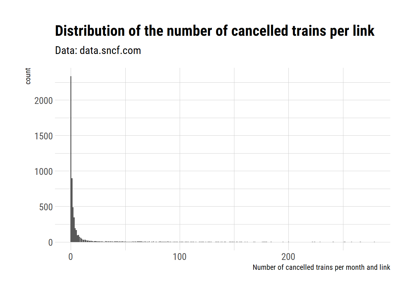
Cancellation rates per station accross years
Since the number of trains is not the same between links, let’s get the percentage of cancelled train per departure station, over all years.
tgv_departure_year <- tgv_departure %>%
  group_by(departure_station, year_ordered) %>%
  summarise(expected_trains  = sum(expected_nb_trains, na.rm = TRUE),
            cancelled_trains = sum(nb_cancelled_trains, na.rm = TRUE),
            cancelation_rate = 100*cancelled_trains / expected_trains) %>%
  ungroup()
tgv_departure_year %>%
mutate(departure_station = fct_reorder(departure_station, cancelation_rate)) %>%
ggplot(aes(x = departure_station, y = year_ordered)) +
geom_tile(aes(fill = cancelation_rate)) +
coord_flip() +
labs(title = "French High Speed Train cancellation rates",
subtitle = "Data: data.sncf.com",
x = "Departure station",
y = "",
fill = "Cancellation rates (%)") +
theme_ipsum_rc() +
theme(axis.text.x = element_text(angle = 90, vjust = 0.5)) +
#scale_fill_viridis_c(option = "cividis", direction = -1) +
scale_fill_gradientn(colours = wes_palette("Zissou1",
100,
type = "continuous"))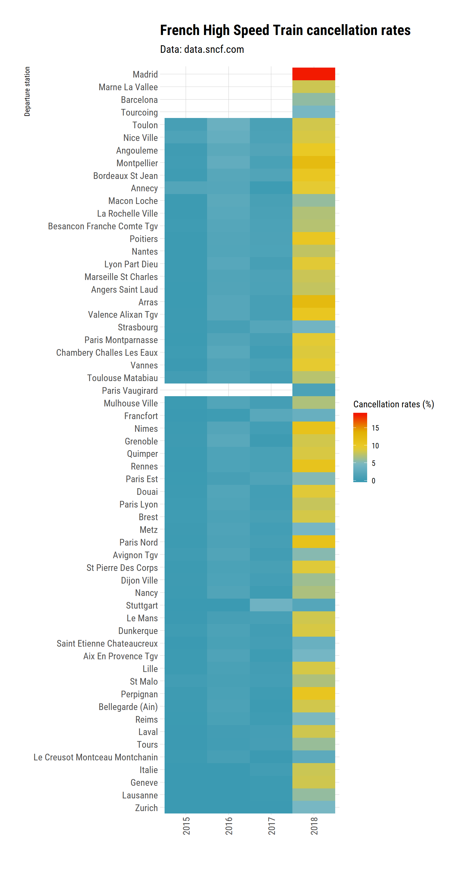
Wow, the effect of the month-long strike of 2018 is very, very clear. And there seem to be a lot of cancellation in 2016 too.
According to the open data of the SNCF, 2016 was one of the 10 biggest strike since 1947.
The data for 2018 is not yet in the SNCF open data about strikes but 2018 will remain in the French memory3 as the 3 months long strike, the longest in the past 30 years. So it is not suprising that 2018 is a bad year in terms of train cancellation. Taking train was hell (M. Mousset, personnal observation).
Trip length and cancellation rates
Let’s see whether the cancellation rates change with trip length. Points represent the average trip length of a link, with the month rate of cancellation for this link.
tgv %>%
  mutate(cancelation_rate = nb_cancelled_trains / expected_nb_trains) %>%
  ggplot(aes(x = trip_duration, y = cancelation_rate)) +
  geom_point(alpha = 0.4, size = 2, colour = "#3B9AB2") +
  geom_smooth(colour = "#EBCC2A") +
  facet_wrap(~year_ordered) +
  labs(title = "French High Speed Train cancellation rates \nand train duration",
       caption = "Cancellation rate do not seem to increase much with trip lenght",
       subtitle = "Data: data.sncf.com",
       x = "Expected trip duration",
       y = "Cancellation rates (%)",
       fill = "Cancellation rates") +
  theme_ipsum_rc()
## `geom_smooth()` using method = 'gam' and formula 'y ~ s(x, bs = "cs")'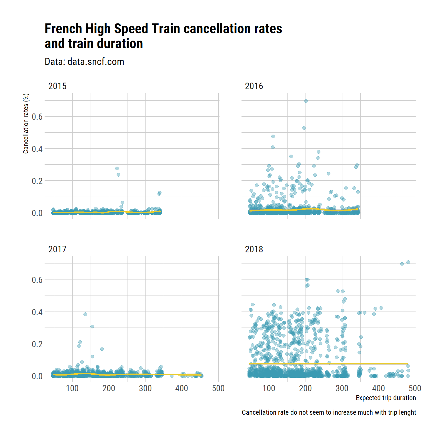
There is no obvious signal of here. train cancellation seem to to be as likely for short and long trips. I could try to actually test it, but I am not that interested.
Worst departure station
Rather, I wonder if there is an all-time bad station?
tgv_departure_all <- tgv_departure %>%
  group_by(departure_station) %>%
  summarise(expected_trains  = sum(expected_nb_trains,
                                   na.rm = TRUE),
            cancelled_trains = sum(nb_cancelled_trains,
                                   na.rm = TRUE),
            cancellation_rate = 100*cancelled_trains / expected_trains) %>%
  mutate(departure_station = fct_reorder(departure_station,
                                         cancellation_rate))

tgv_departure_all %>%
  ggplot(aes(x = departure_station, y = cancellation_rate, fill = expected_trains)) +
  geom_col() +
  coord_flip() +
  labs(title = "All-time cancellation rates of High Speed Train \nper departure station",
       subtitle = "Data: data.sncf.com",
       y = "Train cancellation rate (%)",
       x = "Departure station",
       fill = "Number of planned trains") +
  theme_ipsum_rc() +
  scale_fill_gradientn(colours = wes_palette("Zissou1",
                                             100,
                                             type = "continuous"))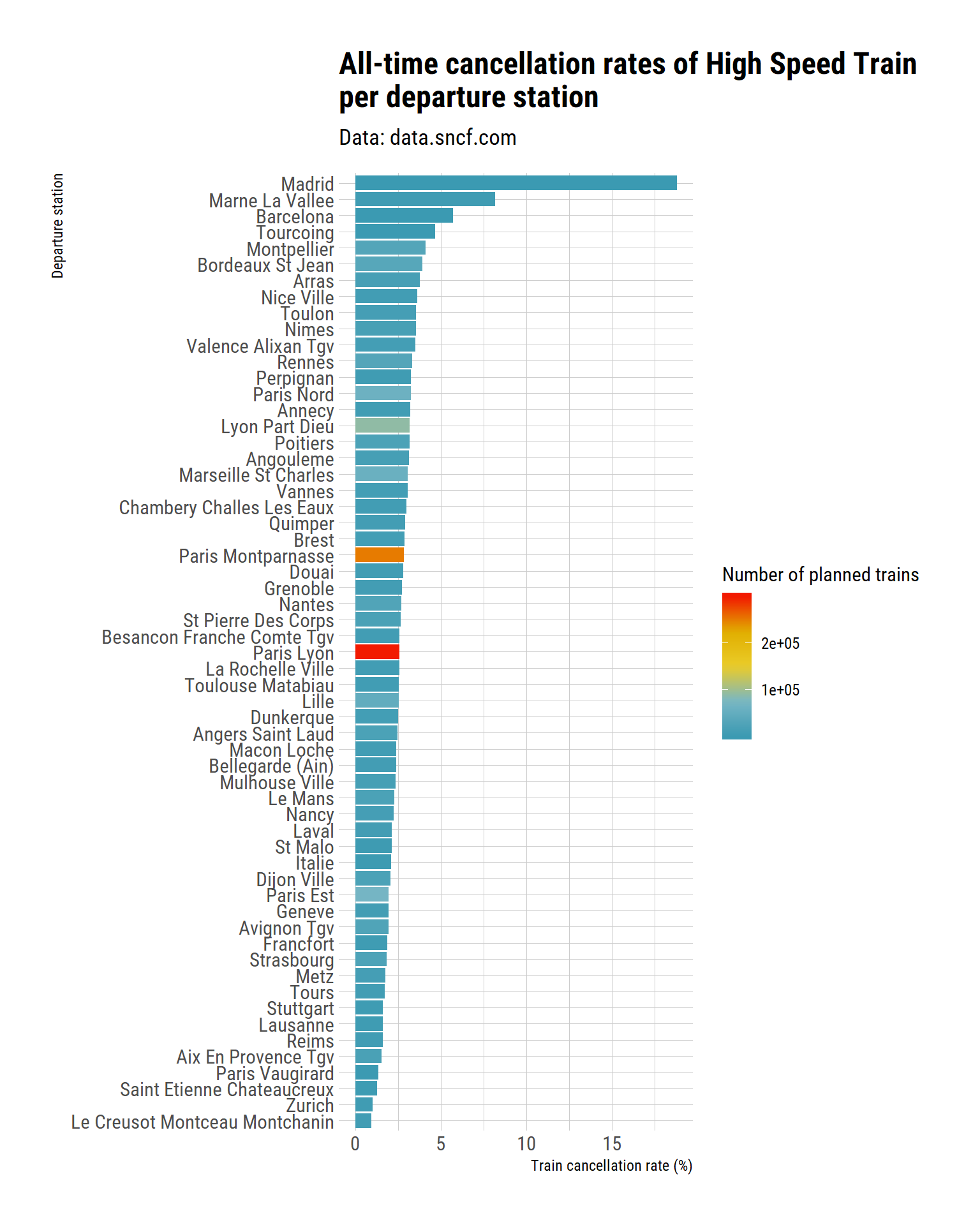
We can see two things. First, the stations with the greatest number of trains are pretty much in the middle of the other stations in terms of cancellation. So the cancellation do not result from just a huge service (and the likely technical problems associated with managing train and people at a bigger scale).
We can also see that Madrid has a pretty bad reccord here, as well as Marnes la Vallee. However, we saw previously that we only have data in 2018 for these stations, and that 2018 was a weird year. Let’s see what happens if we focus on the years 2015-2017.
tgv_departure %>%
  filter(year != 2018) %>%
  group_by(departure_station) %>%
  summarise(expected_trains  = sum(expected_nb_trains,
                                   na.rm = TRUE),
            cancelled_trains = sum(nb_cancelled_trains,
                                   na.rm = TRUE),
            cancellation_rate = 100*cancelled_trains / expected_trains) %>%
  mutate(departure_station = fct_reorder(departure_station,
                                         cancellation_rate)) %>%
  ggplot(aes(x = departure_station, y = cancellation_rate, fill = expected_trains)) +
  geom_hline(yintercept = 1,
             linetype = "dashed",
             colour = "grey70",
             size = 1) +
  geom_hline(yintercept = 2,
             linetype = "dashed",
             colour = "grey70",
             size = 1) +
  geom_col() +
  coord_flip() +
  labs(title = "All-time cancellation rates of High Speed Train \nper departure station,without 2018",
       subtitle = "Data: data.sncf.com",
       y = "Train cancellation rate (%)",
       x = "Departure station",
       fill = "Number of planned trains") +
  theme_ipsum_rc() +
  scale_fill_gradientn(colours = wes_palette("Zissou1",
                                             100,
                                             type = "continuous"))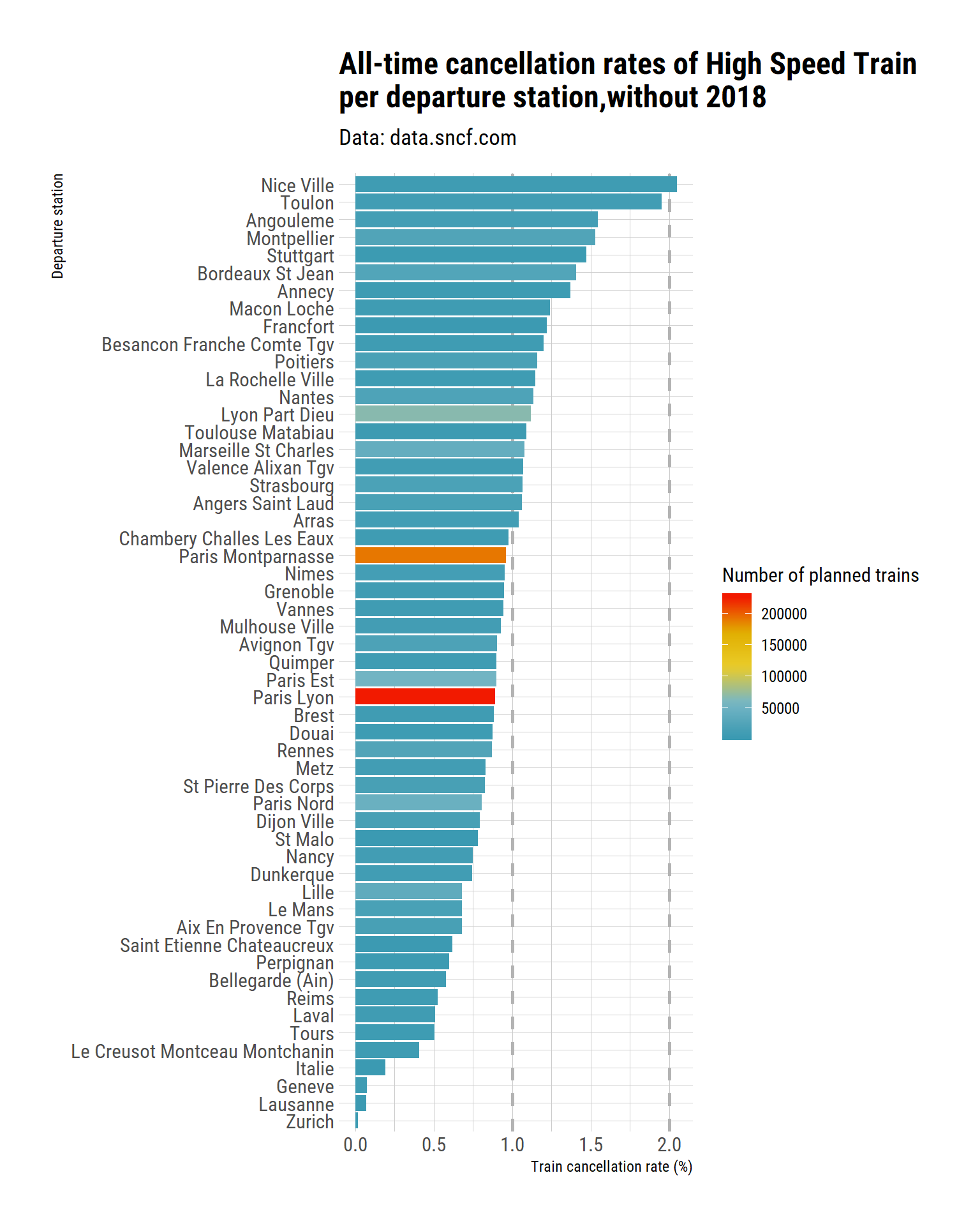
That stations that were supposed to host most departing trains do not seem to be associated with higher or lower cancellation rates.
If I want to focus on the ones with more than 1% of cancelled trains, to shorten the graph:
tgv_departure %>%
  filter(year != 2018) %>%
  group_by(departure_station) %>%
  summarise(expected_trains  = sum(expected_nb_trains,
                                   na.rm = TRUE),
            cancelled_trains = sum(nb_cancelled_trains,
                                   na.rm = TRUE),
            cancellation_rate = 100*cancelled_trains / expected_trains) %>%
  filter(cancellation_rate >= 1) %>%
  mutate(departure_station = fct_reorder(departure_station,
                                         cancellation_rate)) %>%
  ggplot(aes(x = departure_station, y = cancellation_rate, fill = expected_trains)) +
  geom_hline(yintercept = 1,
             linetype = "dashed",
             colour = "grey70",
             size = 2) +
  geom_hline(yintercept = 2,
             linetype = "dashed",
             colour = "grey70",
             size = 2) +
  geom_col() +
  coord_flip() +
  labs(title = "All-time cancellation rates of High Speed\nTrain per departure station,\n2015 - 2018",
       subtitle = "Data: data.sncf.com",
       y = "Train cancellation rate (%)",
       x = "Departure station",
       fill = "Number of planned trains") +
  theme_ipsum_rc() +
  scale_fill_gradientn(colours = wes_palette("Zissou1",
                                             100,
                                             type = "continuous"))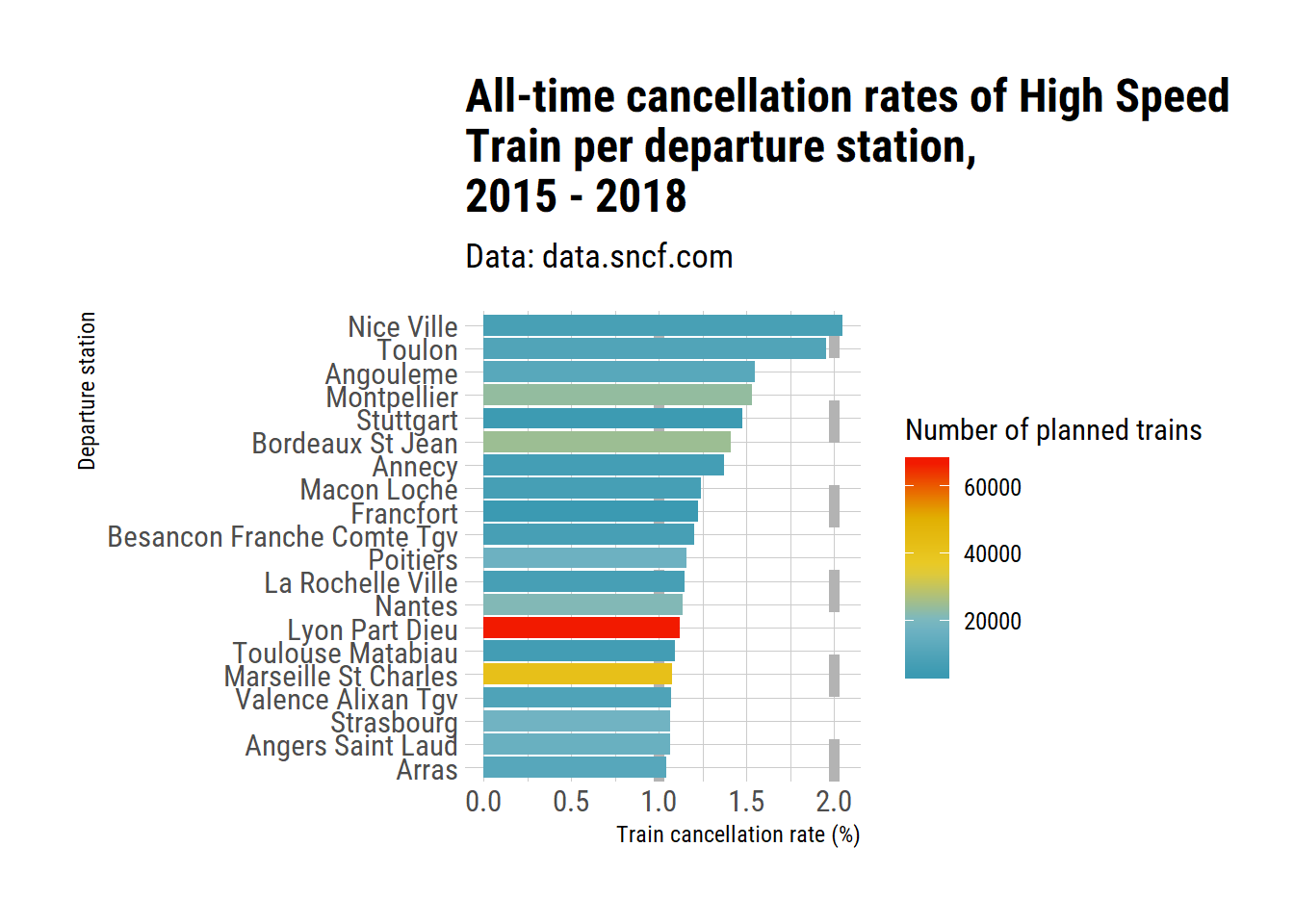
The first two stations are Nice and Toulon, in the PACA region (South-Est of France). I expected Marseille to be with them (from regular complaining from users), but it is not. And Montpellier is the fourth, despite me having never had a cancelled train in many years of use. Which goes to remind us that data is better than impressions and wild guess, if anybody needed the reminder.
Comparison 2017 and 2016, per station
Ok, since the 2018 strike is still vivid in my memory, let’s graphically address the difference between cancellation rates in 2017 and 2018 to remember how bad it was.
tgv_departure %>%
  filter(year %in% c(2017, 2018)) %>%
  group_by(departure_station, year_ordered, month_english) %>%
  summarise(expected_trains  = sum(expected_nb_trains, na.rm = TRUE),
            cancelled_trains = sum(nb_cancelled_trains, na.rm = TRUE),
            cancellation_rate = 100*cancelled_trains / expected_trains) %>%
  select(-expected_trains, -cancelled_trains) %>%
  #spread(year_ordered, cancellation_rate) %>%

  ggplot(aes(x = departure_station,
             y = cancellation_rate,
             group = departure_station,
             colour = year_ordered)) +
  geom_hline(yintercept = 20,
             linetype = "dashed",
             colour = "black",
             size = 1) +
  geom_hline(yintercept = 60,
             linetype = "dashed",
             colour = "black",
             size = 1) +
  geom_line(size = 2, colour = "grey70", alpha = 0.6) +
  geom_point(size = 3) +
  coord_flip() +
  facet_wrap(~month_english) +
  scale_colour_manual(values = c("#3B9AB2", "#F21A00")) +
  labs(title = "Train cancellation rates in 2017 and 2018 \nper station",
       subtitle = "2018 was a baaaaad year!",
       y = "Monthly train cancellation rate (%)",
       x = "Departure station",
       colour = "Year") +
  theme_ipsum_rc() +
  annotate(geom = "text", x = 55, y = 67,
           label = "60%",
           color = "Black") +
  annotate(geom = "text", x = 55, y = 27,
           label = "20%",
           color = "Black")
## geom_path: Each group consists of only one observation. Do you need to
## adjust the group aesthetic?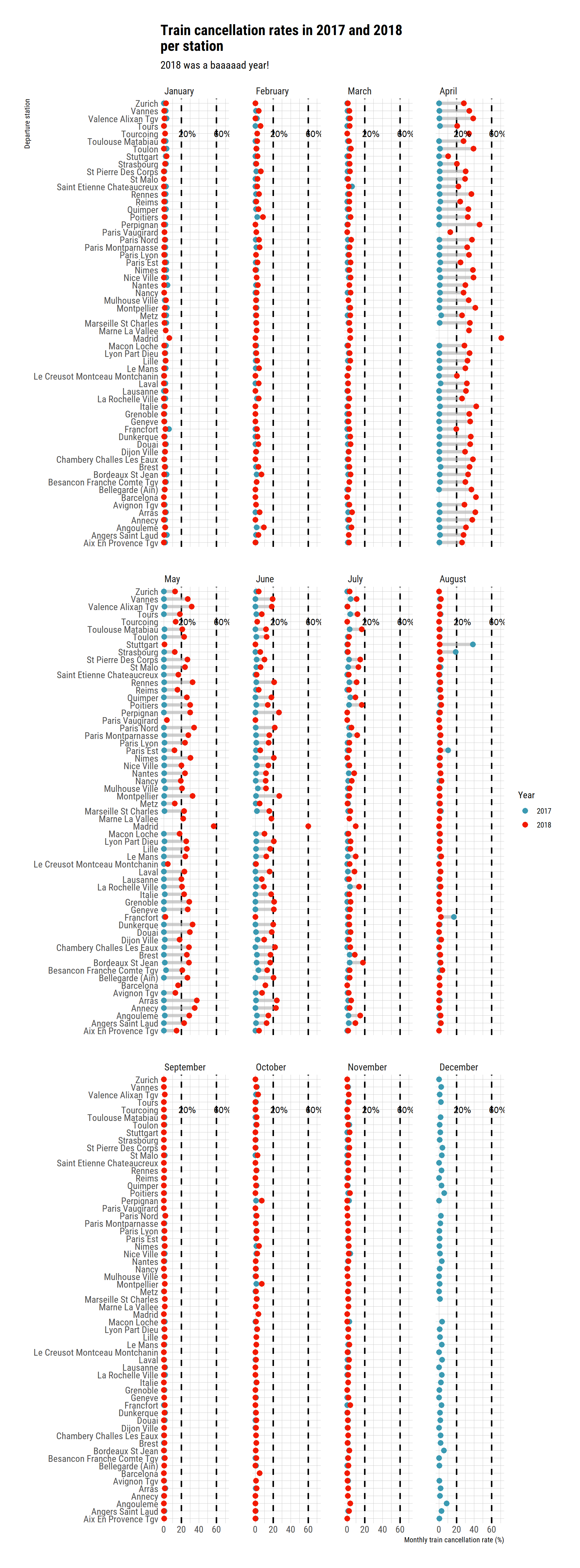
Yep, it was that bad.
Problems at departure
Let’s look at the number of delayed trains at departure station. First, all time rates of delayed trains (and I filter out stations where less than 10% of the trains were delayed).
tgv_departure %>%
  group_by(departure_station) %>%
  summarise(delayed = sum(nb_delayed_trains_departure, na.rm = TRUE),
            trains = sum(nb_trains, na.rm = TRUE)) %>%
  mutate(delay_rate = 100 * delayed / trains,
         station = fct_reorder(departure_station,
                               delay_rate)) %>%
  filter(delay_rate >= 10) %>%

  ggplot(aes(x = station, y = delay_rate,
             fill = trains)) +
  geom_hline(yintercept = 20,
             linetype = "dashed",
             colour = "black",
             size = 1) +
  geom_hline(yintercept = 40,
             linetype = "dashed",
             colour = "black",
             size = 1)  +

  geom_bar(stat = "identity") +
  coord_flip() +
  labs(title = "Percentage of delayed trains per station",
       subtitle = "2015 to 2018, more than 10% of delayed trains",
       y = "Train delay rate (%)",
       x = "Departure station",
       fill = "Number of circulating trains",
       caption = "Data: data.sncf.com") +
  theme_ipsum_rc() +
  scale_fill_gradientn(colours = wes_palette("Zissou1",
                                             100,
                                             type = "continuous"))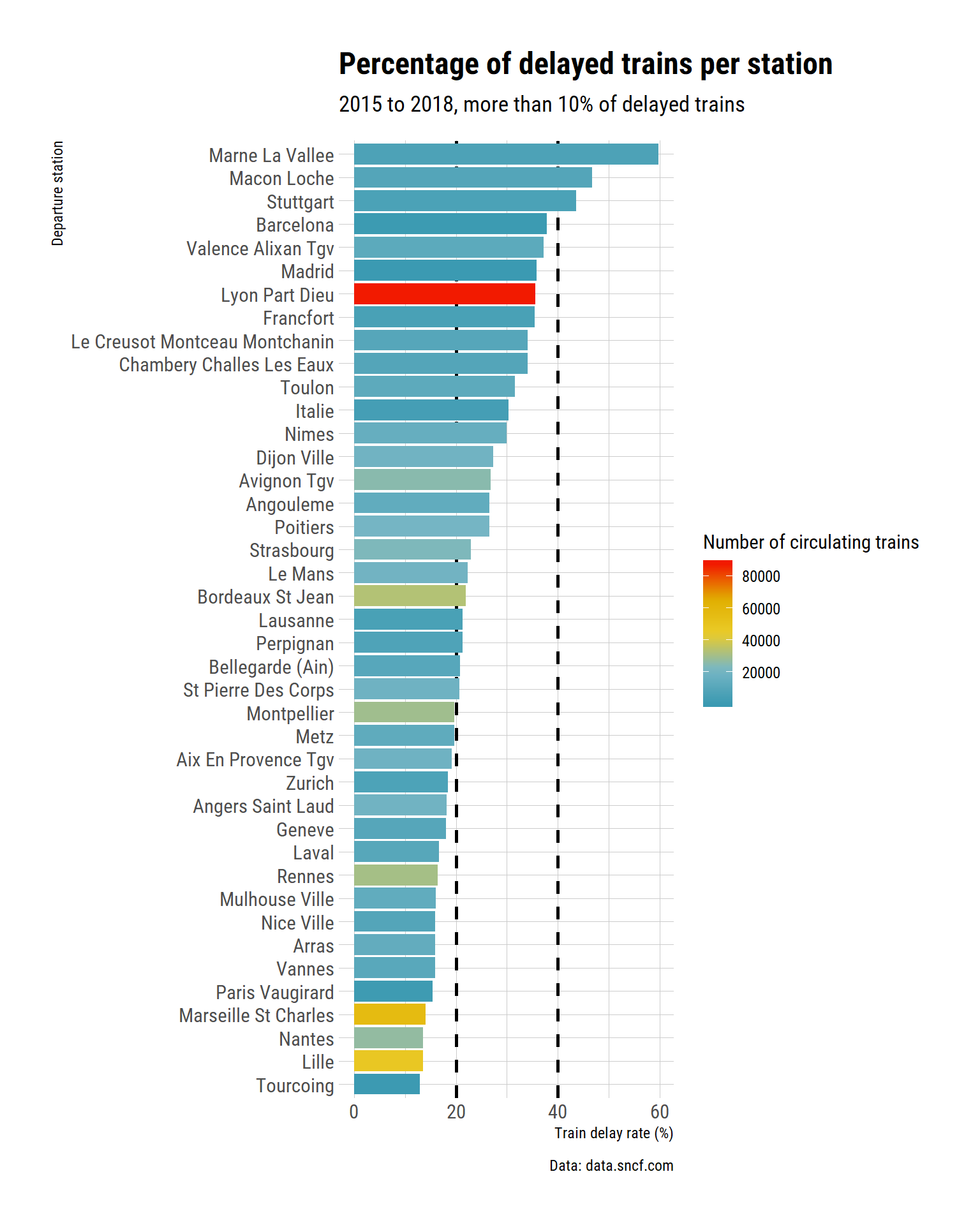
Marnes la Vallée is again our winner. As for cancellation rates, let’s have a look at what happened from 2015 to 2017.
tgv_departure %>%
  filter(year != 2018) %>%
  group_by(departure_station) %>%
  summarise(delayed = sum(nb_delayed_trains_departure, na.rm = TRUE),
            trains = sum(nb_trains, na.rm = TRUE)) %>%
  mutate(delay_rate = 100 * delayed / trains,
         station = fct_reorder(departure_station,
                               delay_rate)) %>%
  filter(delay_rate >= 10) %>%

  ggplot(aes(x = station, y = delay_rate,
             fill = trains)) +
  geom_hline(yintercept = 20,
             linetype = "dashed",
             colour = "black",
             size = 1) +
  geom_hline(yintercept = 40,
             linetype = "dashed",
             colour = "black",
             size = 1)  +

  geom_bar(stat = "identity") +
  coord_flip() +
  labs(title = "Percentage of delayed trains per station",
       subtitle = "2015 to 2017, more than 10% of delayed trains",
       y = "Train delay rate (%)",
       x = "Departure station",
       fill = "Number of circulating trains",
       caption = "Data: data.sncf.com") +
  theme_ipsum_rc() +
  scale_fill_gradientn(colours = wes_palette("Zissou1",
                                             100,
                                             type = "continuous"))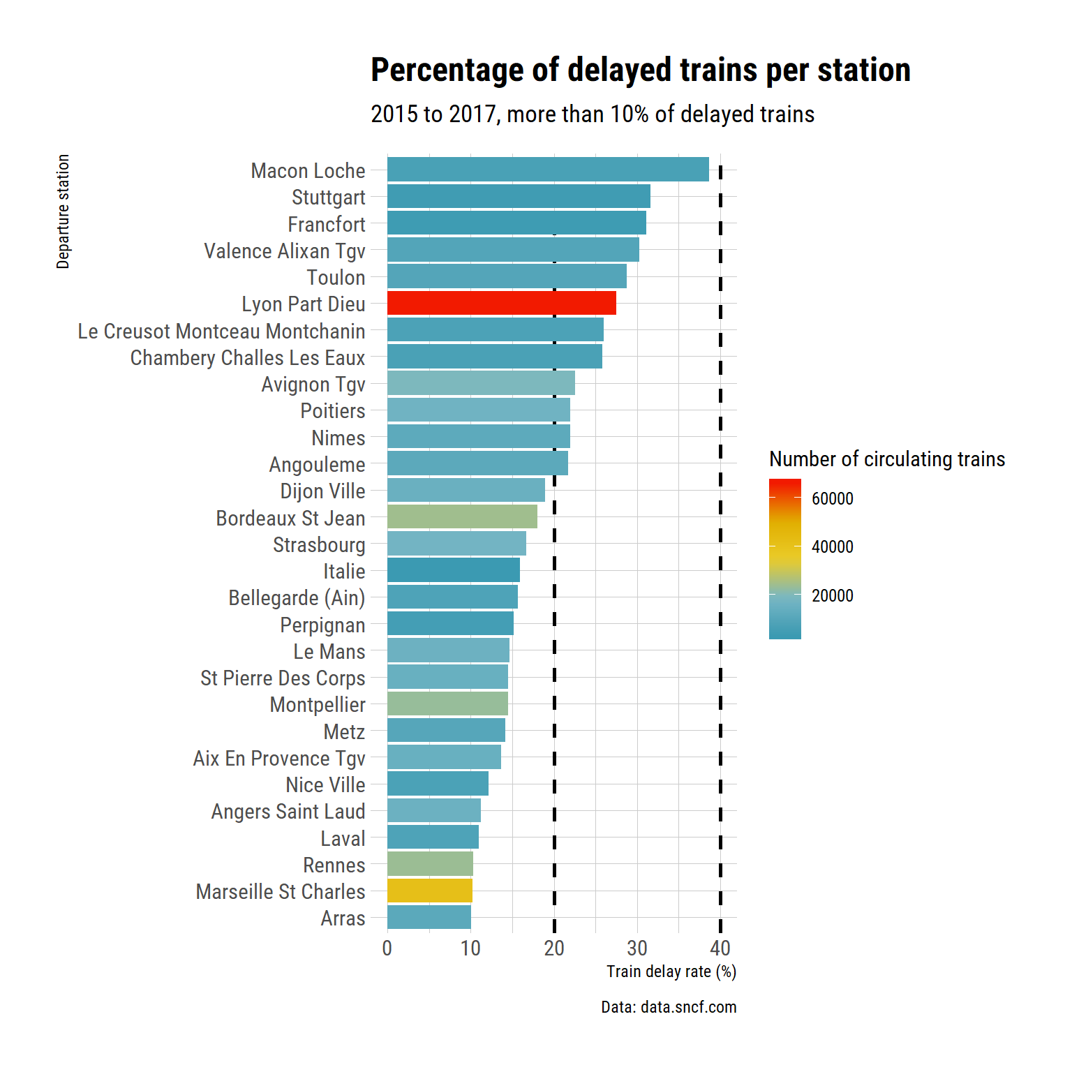
So Toulon is fifth on the list of rate of delayed trains. It seems that the picture is a bit different for cancellation and delay. I supposed that this makes sense as I don’t think cancellation ad delay usually arrise because of the same problems.
Now, per month
tgv_departure %>%
  mutate(delay_rate = 100 * nb_delayed_trains_departure / nb_trains) %>%

  ggplot(aes(x = month_english, y = departure_station,
             fill = delay_rate)) +
  facet_wrap(~year_ordered, ncol = 4) +
  geom_tile() +
  labs(title = "Percentage of delayed trains per departure station",
       y = "Departure station",
       x = "Month",
       fill = "Train delay rate (%)",
       caption = "Data: data.sncf.com") +
  theme_ipsum_rc() +
  scale_fill_gradientn(colours = wes_palette("Zissou1",
                                             100,
                                             type = "continuous")) +
  theme(axis.text.x = element_text(angle = 90))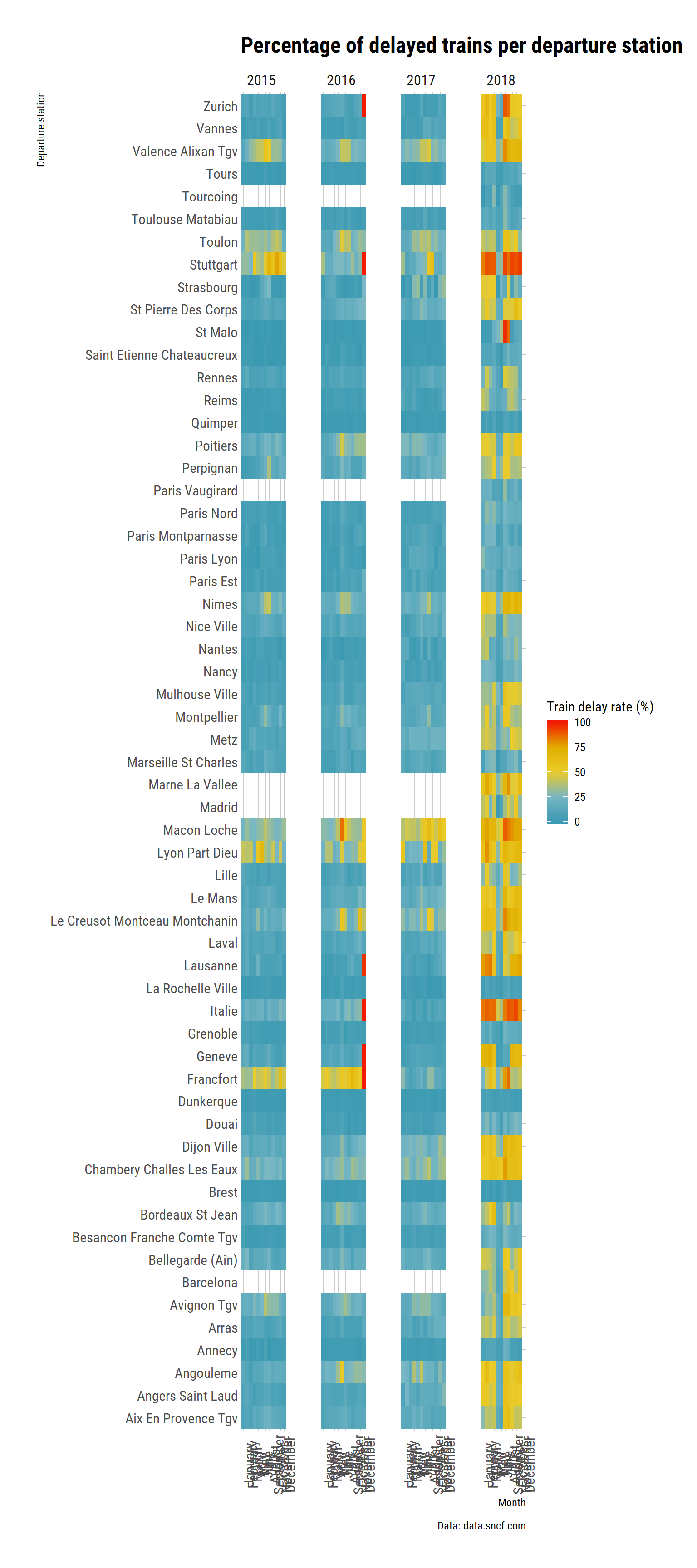
Yes, in some stations, some months, 100% were late to some extent, I checked.
Curiously, the strike in 2018 was associated with smaller delays in May and June: a lot of trains were cancelled, but the one actually runing were relatively more on time. Which makes sense: less traffic on the line, less people attempting to get the train, more trains to choose from (so perhaps lower rates of technical problems, ot at least plenty of replacment options to choose from) etc.
Delay at departure and arrival
Do trains acumulate more delay when they drive?
Because we have many links, let’s look at links where the percentage of delayed train is higher at arrival (so the train accumulates delay on average).
tgv %>%
  mutate(link = paste(departure_station, arrival_station, sep = "-")) %>%
  group_by(link) %>%
  summarise(delayed_departure = sum(nb_delayed_trains_departure,
                                    na.rm = TRUE),
            delayed_arrival = sum(nb_delayed_trains_arrival,
                                  na.rm = TRUE),
            trains = sum(nb_trains,
                         na.rm = TRUE)) %>%

  mutate(rate_delayed_departure = 100 * delayed_departure / trains,
         rate_delayed_arrival = 100 * delayed_arrival / trains,
         diff = rate_delayed_arrival - rate_delayed_departure,
         link = fct_reorder(link, diff)) %>%

  filter(diff > 0) %>%

  ggplot(aes(y = link,
             x = rate_delayed_departure)) +

   geom_segment(aes(x = rate_delayed_departure,
                    xend = rate_delayed_arrival - 0.2,
                    y = link,
                    yend = link),
               arrow = arrow(length = unit(2, "mm")),
               size = 1.5,
               color = "grey60")  +
  geom_point(size = 3, colour = "#3B9AB2") +
  geom_point(aes(x = rate_delayed_arrival),
             size = 3, colour = "#F21A00") +

  labs(title = "Accumulation of delay per link (all time data)",
       subtitle = "Links were the percentage of late trains is higher at arrival",
       y = "Link (departure - arrival)",
       x = "Percentage of delayed trains",
       fill = "",
       caption = "Data: data.sncf.com") +
  theme_ipsum_rc(grid = "XY") +

  annotate(x = 2, y = "Paris Lyon-Lyon Part Dieu",
           label = "Departure",
           geom = "text",
           fontface = "bold",
           colour = "#3B9AB2") +

    annotate(x = 27, y = "Paris Lyon-Lyon Part Dieu",
           label = "Arrival",
           geom = "text",
           fontface = "bold",
           colour = "#F21A00")
Now, which links have trains reducing their delay?
tgv %>%
  mutate(link = paste(departure_station, arrival_station, sep = "-")) %>%
  group_by(link) %>%
  summarise(delayed_departure = sum(nb_delayed_trains_departure,
                                    na.rm = TRUE),
            delayed_arrival = sum(nb_delayed_trains_arrival,
                                  na.rm = TRUE),
            trains = sum(nb_trains,
                         na.rm = TRUE)) %>%

  mutate(rate_delayed_departure = 100 * delayed_departure / trains,
         rate_delayed_arrival = 100 * delayed_arrival / trains,
         diff = rate_delayed_arrival - rate_delayed_departure,
         link = fct_reorder(link, diff)) %>%

  filter(diff < 0) %>%

  ggplot(aes(y = link,
             x = rate_delayed_departure)) +

   geom_segment(aes(x = rate_delayed_departure,
                    xend = rate_delayed_arrival + 0.2,
                    y = link,
                    yend = link),
               arrow = arrow(length = unit(2, "mm")),
               size = 1.5,
               color = "grey60")  +
  geom_point(size = 3, colour = "#3B9AB2") +
  geom_point(aes(x = rate_delayed_arrival),
             size = 3, colour = "#F21A00") +

  labs(title = "Reduction of initial delay per link (all time data)",
       subtitle = "Links were the percentage of late trains is higher at departure",
       y = "Link (departure - arrival)",
       x = "Percentage of delayed trains",
       fill = "",
       caption = "Data: data.sncf.com") +
  theme_ipsum_rc(grid = "XY") +

  annotate(x = 2, y = "Avignon Tgv-Paris Lyon",
           label = "Departure",
           geom = "text",
           fontface = "bold",
           colour = "#3B9AB2") +

    annotate(x = 27, y = "Avignon Tgv-Paris Lyon",
           label = "Arrival",
           geom = "text",
           fontface = "bold",
           colour = "#F21A00")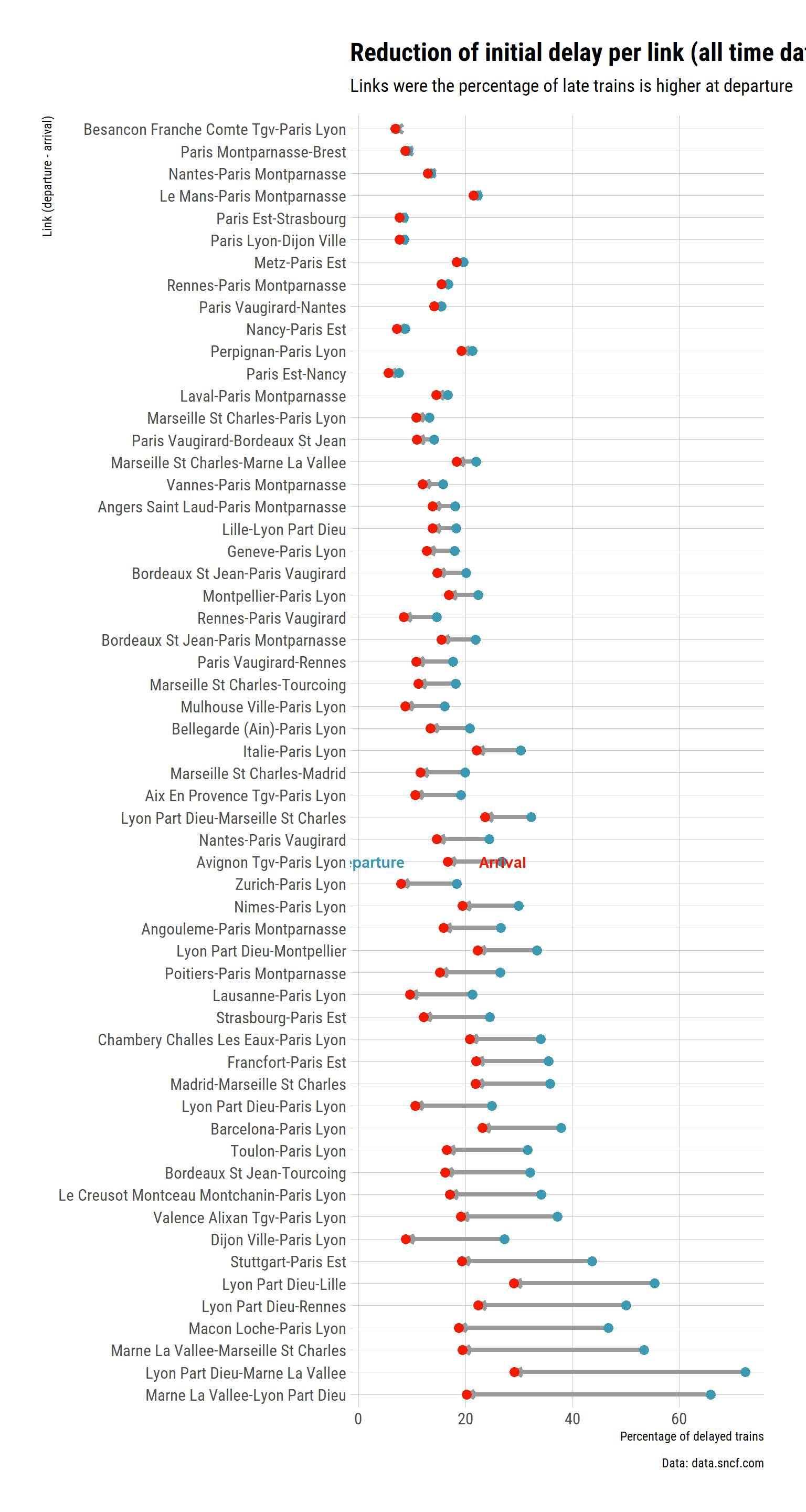
So it seems that the station Marne la Vallée has high rates of delay (nothing we have not seen before), but the the pecentage of delayed trains at the other end of the links is much lower (at least for Lyon Part Dieu, and Marseille). Globally, it seems that trains manage to catch up delay between Lyon and Marnes. Which makes sense because if they don’t stop at Creusot, there is a long straight patch where they can gain and maintain speed.
Mean delay
Before, we only looked the percentage of late trains at departure, and/or arrival. Byut this measurement did not take into account the length of the delay.
Let’s first look at the average delay of late trains at departure:
tgv %>%
  mutate(link = paste(departure_station, arrival_station, sep = "-")) %>%

  ggplot(aes(x = link, y = month_english)) +
  geom_tile(aes(fill = mean_delay_departure)) +
  coord_flip() +
  facet_wrap(~year_ordered, nrow = 1) +
  labs(title = "French High Speed Train average delay at departure (late trains only)",
       subtitle = "Data: data.sncf.com",
       x = "Departure station",
       y = "",
       fill = "Lenght delay (min)") +
  theme_ipsum_rc() +
  theme(axis.text.x = element_text(angle = 90, vjust = 0.5)) +
  #scale_fill_viridis_c(option = "cividis", direction = -1) +
  scale_fill_gradientn(colours = wes_palette("Zissou1",
                                             100,
                                             type = "continuous"))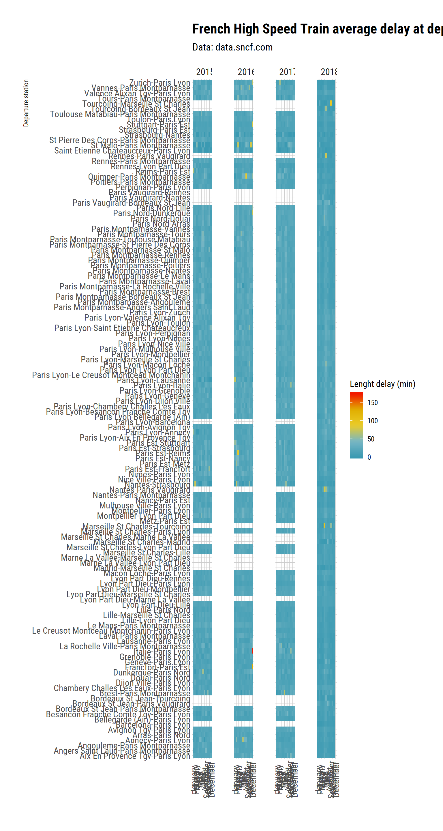
I am surprised by how little patterns there is. The Italie Station seems to be driving the dataset. Let’s see if I remove it:
tgv %>%
  filter(departure_station != "Italie") %>%
  filter(departure_station != "Francfort") %>%
  mutate(link = paste(departure_station, arrival_station, sep = "-")) %>%

  ggplot(aes(x = link, y = month_english)) +
  geom_tile(aes(fill = mean_delay_departure)) +
  coord_flip() +
  facet_wrap(~year_ordered, nrow = 1) +
  labs(title = "French High Speed Train average delay at departure (late trains only)",
       subtitle = "Data: data.sncf.com",
       x = "Departure station",
       y = "",
       fill = "Lenght delay (min)") +
  theme_ipsum_rc() +
  theme(axis.text.x = element_text(angle = 90, vjust = 0.5)) +
  #scale_fill_viridis_c(option = "cividis", direction = -1) +
  scale_fill_gradientn(colours = wes_palette("Zissou1",
                                             100,
                                             type = "continuous"))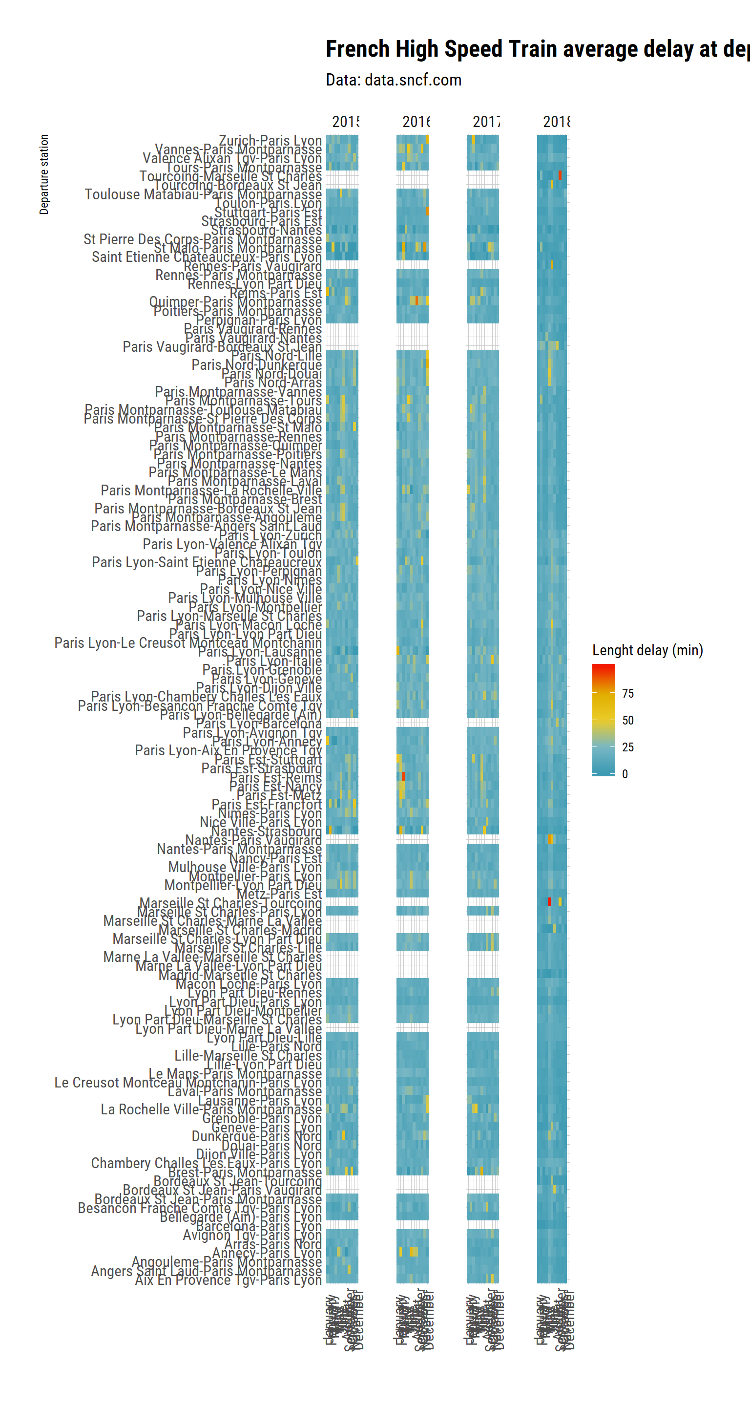
Well, this is still not highly informative I am afraid. Some stations have patches of rough time (maybe because of works within the station or on the rails close to the station), and there seem to be small differences between station, but nothing extaordinary catches my eye.