This week Tidytuesday’s data concern US research and development budget. Three files were provided, with budget data for Research & Development, climate and energy. This dataset was originally collected by the American Association for the Advancement of Science.
I will focus on the R&D budget. I wish to know which agencies get the highest funding, and how research funding evolved in the past 40 years. I kind of suspect that they decreased, and I would like to check whether that’s true.
Today’s exploration will be quite simple, and I will use mostly dplyr to summarise data per agencies, and ggplot2 to plot things. A little trick, though is the package scales that is used to write percentage signs on the plot axis.
And I use the hrbrthemes for the beautiful themes. One day I will make my own professional-looking theme. One day…
First we import the data directly from Github.
read.csv("https://raw.githubusercontent.com/rfordatascience/tidytuesday/master/data/2019/2019-02-12/fed_r_d_spending.csv") %>% mutate(rd_budget_billion = rd_budget/(10^9)) -> feder_spendingsWe have a first look at the structure of the data. The data.frame is pretty straightforward:
- department the abbreviated name of the federal agencies
- year
- rd_budget the budget for research and development - total_outlays the money actually paid out by the U.S. Treasury
- GDP the Gross Domestic Product, which represent the US economy
- discretionary_outlays represent the part of the budget that pays for governmental programs. These spending levels are set each year by Congress. Yes, I had check the meaning…
I also created a column with the R&D budget in billions, because it makes numbers easier to grasp.
glimpse(feder_spendings)## Observations: 588
## Variables: 7
## $ department <fct> DOD, NASA, DOE, HHS, NIH, NSF, USDA, Int...
## $ year <int> 1976, 1976, 1976, 1976, 1976, 1976, 1976...
## $ rd_budget <dbl> 3.5696e+10, 1.2513e+10, 1.0882e+10, 9.22...
## $ total_outlays <dbl> 3.718e+11, 3.718e+11, 3.718e+11, 3.718e+...
## $ discretionary_outlays <dbl> 1.756e+11, 1.756e+11, 1.756e+11, 1.756e+...
## $ gdp <dbl> 1.790e+12, 1.790e+12, 1.790e+12, 1.790e+...
## $ rd_budget_billion <dbl> 35.696, 12.513, 10.882, 9.226, 8.025, 2....Total R&D budget
Since we are dealing with data through time, and with 14 categories, two types of visualization jumped directly to my mind: a heat map and a line plot. Both of them are pretty easy to make with ggplot2.
From the heat map, what is obvious is that some agencies receive far more money than some others. DOD stands for the department of defence, and it seemed to be the singlets most funded agency, which anybody with even a varnish of history knowledge about the U.S. would expect. NASA also have high funding, which is not totally surprising, especially given the data on Space Launches that we explored for #Tidytuesday week 3. The two remaining agencies that stand out, HHS and DOE perform health research.
feder_spendings %>%
  ggplot(aes(x = department, y = year,
             fill = rd_budget_billion)) +
  coord_flip() +
  geom_tile() +
  labs(title = "R&D budget per agency and year",
       y = "Year",
       x = "Federal agency",
       fill = "Inlfation adjusted budget\n(billion $)",
       subtitle = "Department (DOD), health (NIH, HHS) and energy (DOE) \nhave the highest funding...",
       caption = "Source data: American Association for the Advancement of Science\nInflation adjusted dollars") +
  scale_fill_viridis_c(option = "inferno") +
  theme_ipsum_tw()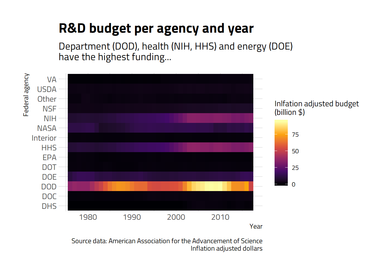
Because of the huge variation of funding between agencies, the heat map representation limits us in seeing the finer patterns. So let’s go back to good old line graphs. Since we already know which agencies are the most funded, I make a plot by agency, with free scale on the y axis.
feder_spendings %>%
  ggplot(aes( x = year, y = rd_budget_billion,
              colour = department,
              fill   = department)) +
  facet_wrap(~department, scales = "free_y", ncol = 3) +
  geom_line(size = 1) +
  geom_area(alpha = 0.5) +
  geom_point(size = 2) +

  labs(title = "R&D budget per agency and year",
       x = "Year",
       y = "Inflation-adjusted budget (billion $)",
       colour = "",
       caption = "Source data: American Association for the Advancement of Science") +
  scale_colour_viridis_d(option = "inferno") +
  scale_fill_viridis_d(option = "inferno") +
  theme_ipsum_tw() +
  theme(legend.position = "none",
        panel.grid.major = element_blank(),
        strip.text = element_text(face = "bold"))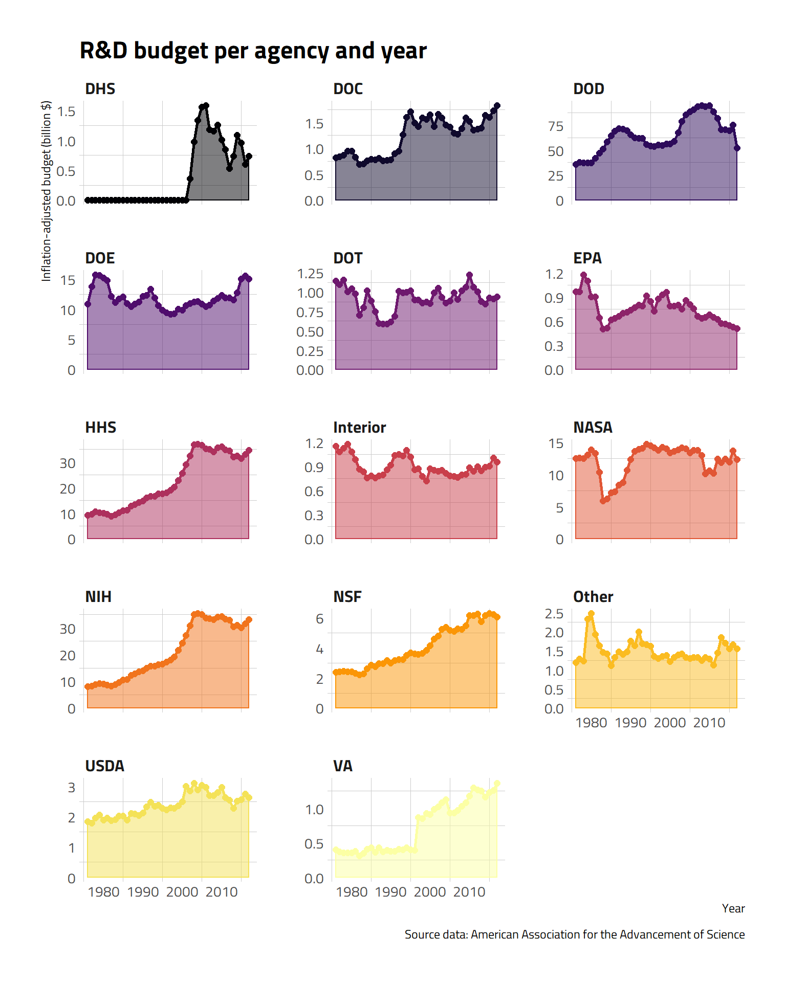
We can see that the budget of defence has steadily risen, with a bump in after year 2000. NASA budget was brutally reduced during the mid-eighties, but recovered and has been mostly stable since.The NIH and NSF budget have slowly increased over years, although NIH is now stagnating.
R&D budget relative to total federal budget
Now, let’s have a look at how much percent of the total federal budget is invested in these agencies. This informs us on the politic decisions on budget allocation between the different services.
feder_spendings %>%
  # Get proportion of budget
  mutate(rd_rate = rd_budget / total_outlays) %>%
  # Plot
  ggplot(aes(x = year, y = rd_rate,
             colour = department,
             fill   = department)) +
  facet_wrap(~department, scales = "free_y", ncol = 3) +

  geom_line(size = 1) +
  geom_area(alpha = 0.5) +
  geom_point(size = 2) +

  labs(title = "Percentage of total federal budget invested in R&D in the USA",
       y = "Year",
       subtitle = "...but massive decrease of R&D funding over years (relative to total budget)",
       x = "Percentage of US budget",
       caption = "Source data: American Association for the Advancement of Science") +

  scale_colour_viridis_d(option = "inferno") +
  scale_fill_viridis_d(option = "inferno") +
  scale_y_continuous(labels = scales::percent) +

  theme_ipsum_tw() +
  theme(legend.position = "none",
        panel.grid.major = element_blank(),
        strip.text = element_text(face = "bold"))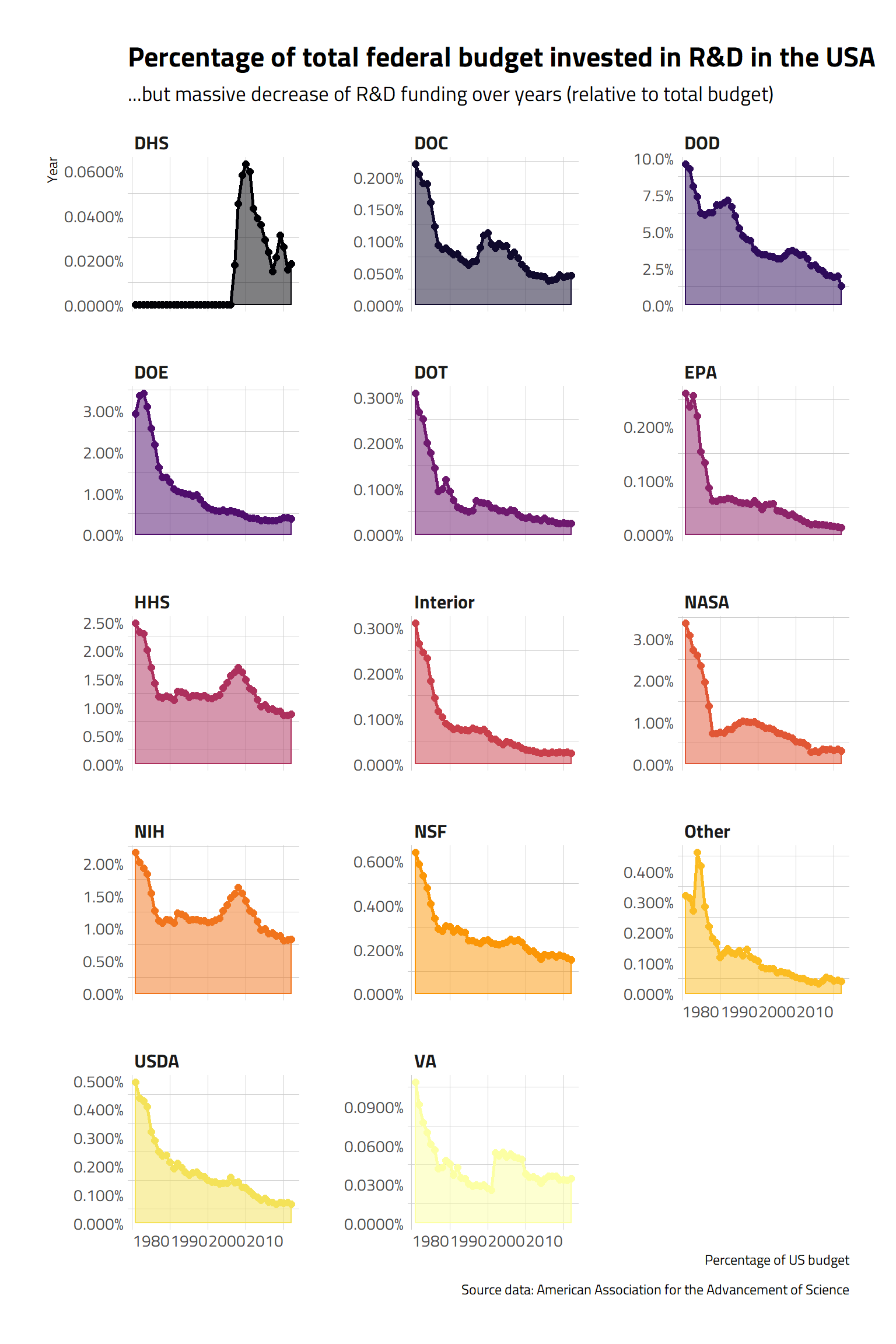
Clearly, the decision has been to decrease investment in R&D over all agencies, and thus all thematics.
R&D budget relative to GDP
If we now investigate what the different budget represent compared to the GDP of the U.S.
feder_spendings %>%
  # Get proportion of budget
  mutate(rd_rate = rd_budget / gdp) %>%

  ggplot(aes( x = year, y = rd_rate,
              colour = department,
              fill   = department)) +
  facet_wrap(~department, scales = "free_y", ncol = 3) +

  geom_line(size = 1) +
  geom_area(alpha = 0.5) +
  geom_point(size = 2) +

  labs(title = "Percentage of GDP invested in R&D in the USA",
       x = "Year",
       subtitle = "Massive decrease of R&D funding over years (relative to GDP)",
       y = "R&D budget as percents of GPD",
       colour = "",
       caption = "Source data: American Association for the Advancement of Science") +
  scale_colour_viridis_d(option = "inferno") +
  scale_fill_viridis_d(option = "inferno") +
  theme_ipsum_tw() +
  theme(legend.position = "none",
        panel.grid.major = element_blank(),
        strip.text = element_text(face = "bold"))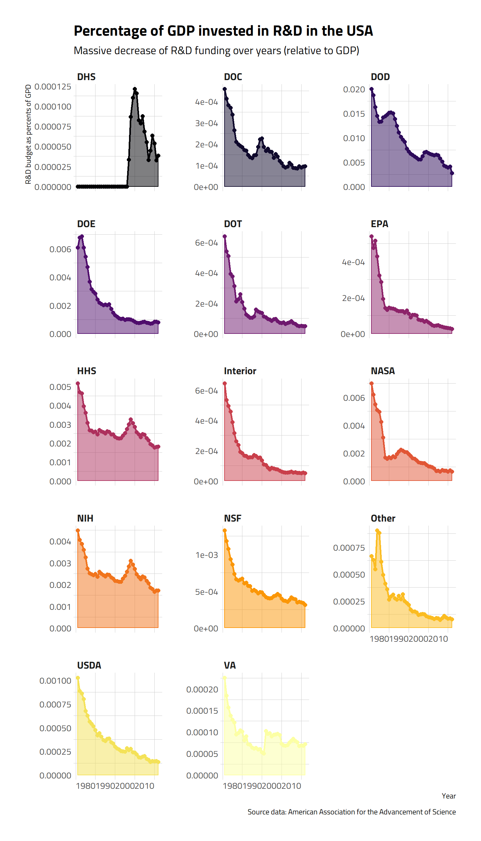
In recent years, the budget invested in research and development, compared to the GDP has been decreasing for pretty much all agencies.
Cumulative R&D budget over years
If we add the total amount of money invested in R&D fr each agencies over the forty years:
# Sum the budget and R&D budget per agency over all years, and then take the proportion invested in R&D
feder_spendings %>%
  group_by(department) %>%
  summarise(total_founded = sum(rd_budget, na.rm = TRUE),
            total_budget  = sum(total_outlays, na.rm = TRUE)) %>%
  mutate(total_founded_billions = total_founded / (10^9),
         rd_rate = total_founded/total_budget,
         department = fct_reorder(department, rd_rate)) -> feder_total
Here again, we can see that the U.S. invested a huge amount of money in R&D for defence (over 2500 billion $) over the years. I cannot even understand what that sum of money means. They invested a bit less than 2000 billion $ in health.
ggplot(data = feder_total,
       aes(x = department, y = total_founded_billions)) +
  coord_flip() +
  geom_col() +
  geom_col(data = filter(feder_total,
                         department == "DOD"),
           fill =  "#56106EFF") +
  geom_col(data = filter(feder_total,
                         department == "NIH" | department == "HHS"),
           fill = "#BB3754FF") +
  geom_col(data = filter(feder_total,
                         department == "NSF"),
           fill = "#F98C0AFF") +

  labs(title = "Total R&D budget per agency, 1976-2018",
       y = "R&D budget (billion $)",
       x = "Federal agency",
       subtitle = "Total invesments in the past 40 years have been huge in defence, and\nmoderate in health",
       caption = "Source data: American Association for the Advancement of Science\nInflation adjusted dollars") +
  theme_ipsum_tw()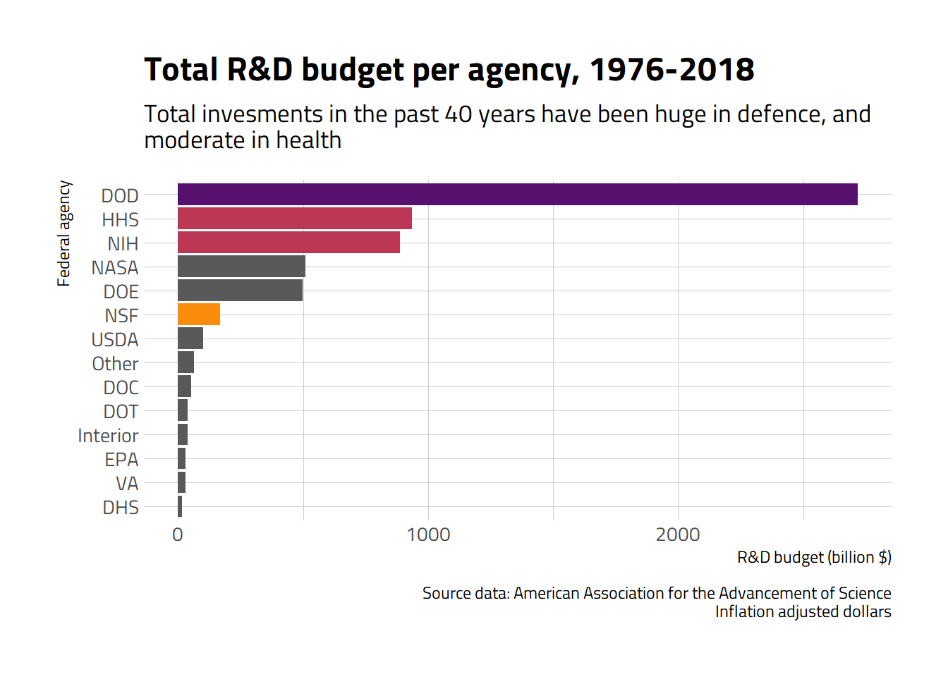
A litte focus on the National Science Fundation
As a biologist, the NSF would be the main funding agency if I were working in the U.S., so let’s single it out.
feder_spendings %>%
  filter(department == "NSF") %>%

  ggplot(aes(x = year, y = rd_budget_billion,
             colour = department,
             fill = department)) +
  geom_line(size = 1) +
  geom_area(alpha = 0.5) +
  geom_point(size = 2) +

  labs(title = "National Science Fundation budget 1976-2017",
       subtitle = "The total budget of the NSF increases with time...",
       x = "",
       y = "Inflation-adjusted budget (billion $)",
       colour = "",
       caption = "Source data: American Association for the Advancement of Science") +
  scale_colour_viridis_d(option = "inferno") +
  scale_fill_viridis_d(option = "inferno") +
  theme_ipsum_tw() +
  theme(legend.position = "none",
        panel.grid.major = element_blank())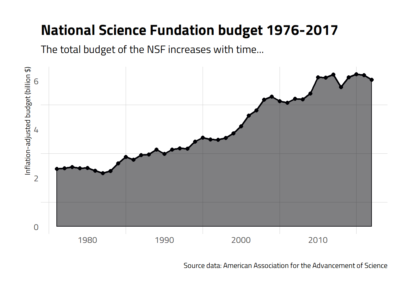
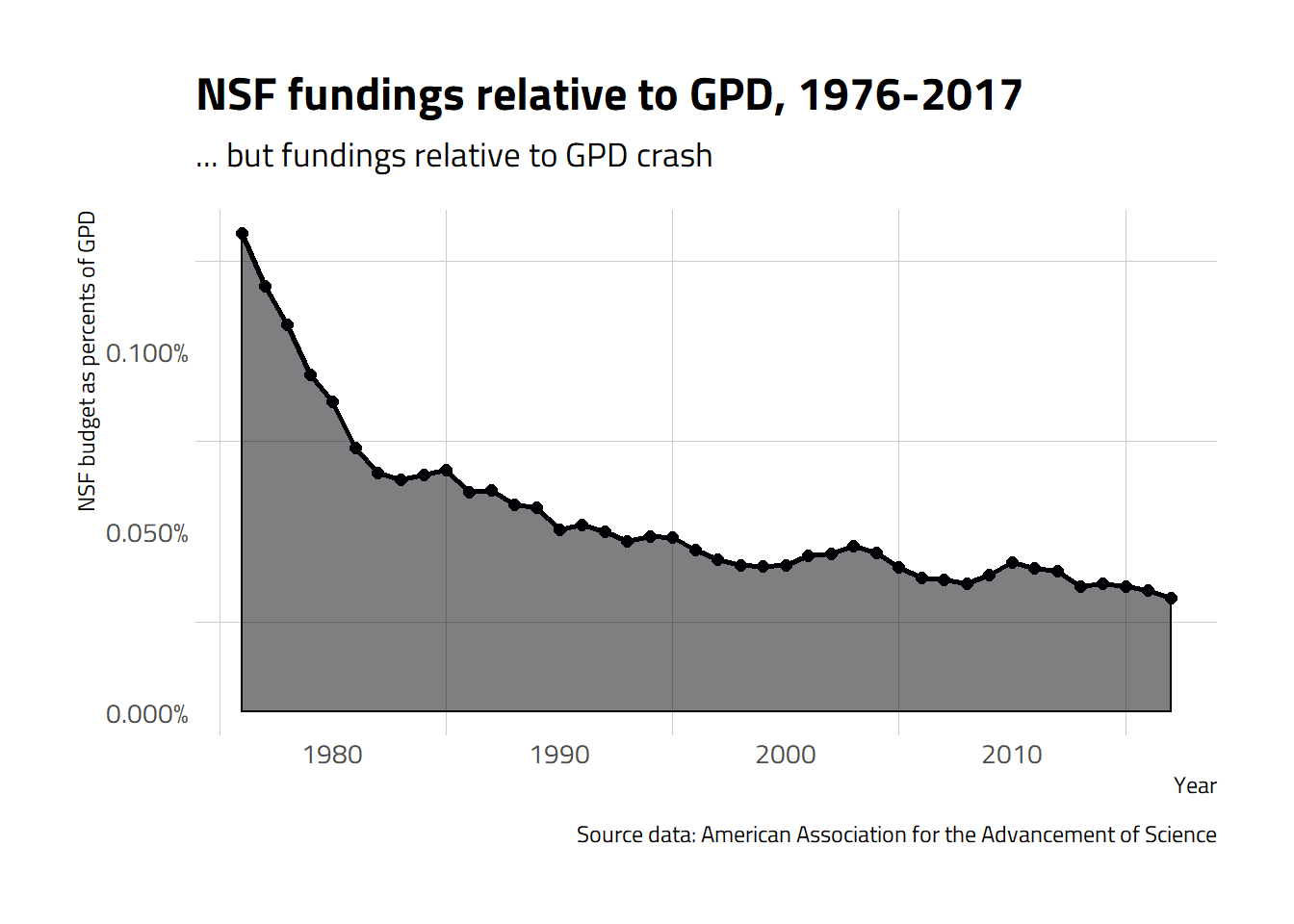
feder_spendings %>%
  filter(department == "NSF") %>%
  mutate(rd_rate = rd_budget / gdp) %>%
  ggplot(aes(x = year, y = rd_rate,
             colour = department,
             fill = department)) +
  geom_line(size = 1) +
  geom_area(alpha = 0.5) +
  geom_point(size = 2) +

  labs(title = "NSF fundings relative to GPD, 1976-2017",
       subtitle = "... but fundings relative to GPD crash",
       x = "Year",
       y = "NSF budget as percents of GPD",
       colour = "",
       caption = "Source data: American Association for the Advancement of Science") +
  scale_colour_viridis_d(option = "inferno") +
  scale_fill_viridis_d(option = "inferno") +
  scale_y_continuous(labels = scales::percent) +
  theme_ipsum_tw() +
  theme(legend.position = "none",
        panel.grid.major = element_blank())